Monthly Archives: November 2014
Holbein Acryla Gouache
 When I was younger and attended after school art class, the teachers always set our painting projects to be acrylic paint on canvas. This was a good starting point for any amateur painter as acrylics are water based and easy to clean up, and you can easily paint over mistakes on a canvas without worrying about over-saturation or bleeding. Fast forward to 2014 and I now love working on paper, whether it is with graphite, pencils or watercolours, but none of these mediums gave me the solid matte colours i desired for illustration, and that is when i discovered gouache. The best way to describe gouache is an opaque watercolour, and I believe it was originally created for graphic artists to create illustrations and that is perfect for my needs. I first started using Winsor & Newton gouache but I found it had a very limited colour range. This is not a problem if you are a pro at mixing colours, and know your colour theory like the back of your hand, but I have a design background and honestly know nothing about fine art.
I thus began hunting for other gouache brands that were professional grade quality and came across the Holbein range. Holbein have two different gouaches, they have a classic professional grade Designer’s gouache and Acryla Gouache. I went for the Acryla range because it reacts much the same as traditional gouache, but it is basically waterproof when it dries, so you are able to layer light colours over darker ones without any paint lifting or bleeding into one another. The paints dry in a beautiful matte velvety texture and are super opaque. I found the Acryla Gouache to have a much runnier consistency than Winsor & Newton; this is actually a VERY good characteristic for me, as it means I can glide the paint across a page far more smoothly without having to dilute it and thus compromising on it’s pigmentation. The runnier consistency also seems to be easier to squeeze out of the plastic tubes, so you can squeeze out just a tiny dot if you need to. I also love the plastic tubes over the metal ones, as I prefer the tube to bounce back in to it’s original shape and is easier to control how much you squeeze out.
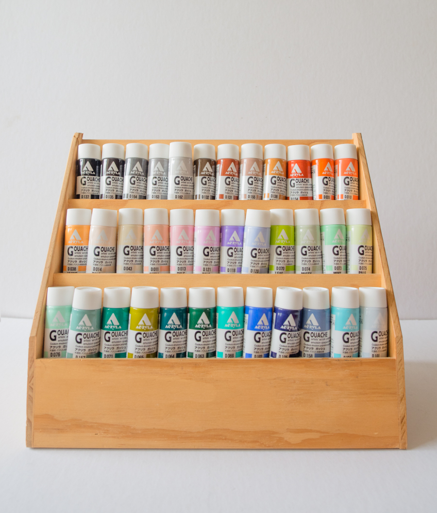
 The one down side to the Holbein Acryla Gouache is that the colours are not named in a traditional fine art sense, so you don’t know which pigments make up the colour; the trade off is that you get an amazing array of colours that are difficult to mix yourself. My favourites are the beautiful ash and pale colours, as they are muted in colour but are not muddy. The Acryla Gouache range comes in a total of 102 colours, including ten metallic and 4 luminous finishes, I only bought 36 colours to add to the Winsor and Newton colours I already own. I have a very strong feeling that I will be purchasing more though as I have absolutely fallen in love with these paints! unfortunately they are not available in Australia, they are made in Japan and I had to buy them online. I chose the colours rather blindly as I could not see real swatches, so I have included the paint swatches of the colours I got below. (Lighting and screen calibrations will obviously affect the look, so please use these as a rough guide.)


From L to R: Lamp Black, Sepia, Grey No.4, Neutral Grey No.3, Neutral Grey No.2, Raw Umber.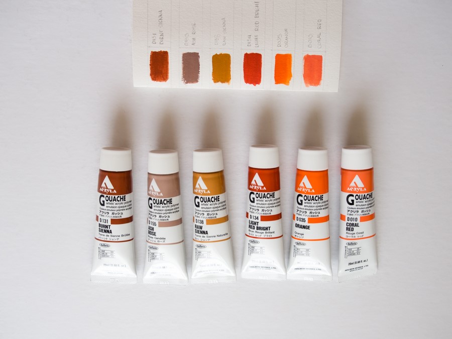
From L to R: Burnt Sienna, Ash Rose, Raw Sienna, Light Red Bright, Orange, Coral Red.
From L to R: Jaune Brilliant, Pale Peach, Beige, Shell Pink, Pale Pink, Pale Lilac.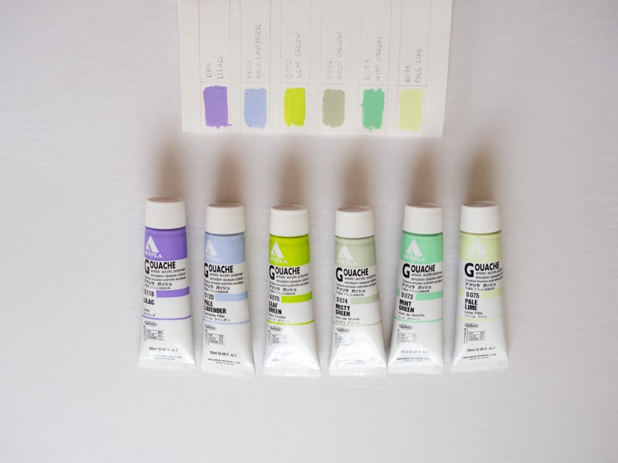
From L to R: Lilac, Pale Lavender, Leaf Green, Misty Green, Mint Green, Pale Lime.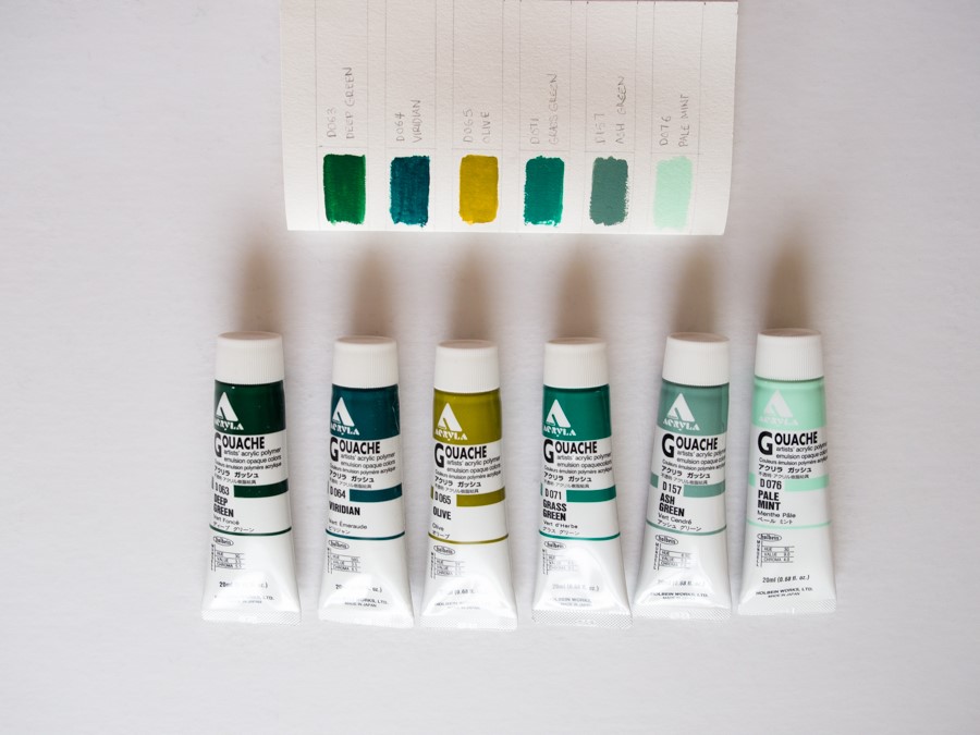
From L to R: Deep Green, Viridian, Olive, Grass Green, Ash Green, Pale Mint.
From L to R: Ice Green, Smalt Blue, Prussian Blue, Ash Blue, Pale Aqua, Misty Blue.
