Yearly Archives: 2014
Holbein Acryla Gouache
 When I was younger and attended after school art class, the teachers always set our painting projects to be acrylic paint on canvas. This was a good starting point for any amateur painter as acrylics are water based and easy to clean up, and you can easily paint over mistakes on a canvas without worrying about over-saturation or bleeding. Fast forward to 2014 and I now love working on paper, whether it is with graphite, pencils or watercolours, but none of these mediums gave me the solid matte colours i desired for illustration, and that is when i discovered gouache. The best way to describe gouache is an opaque watercolour, and I believe it was originally created for graphic artists to create illustrations and that is perfect for my needs. I first started using Winsor & Newton gouache but I found it had a very limited colour range. This is not a problem if you are a pro at mixing colours, and know your colour theory like the back of your hand, but I have a design background and honestly know nothing about fine art.
I thus began hunting for other gouache brands that were professional grade quality and came across the Holbein range. Holbein have two different gouaches, they have a classic professional grade Designer’s gouache and Acryla Gouache. I went for the Acryla range because it reacts much the same as traditional gouache, but it is basically waterproof when it dries, so you are able to layer light colours over darker ones without any paint lifting or bleeding into one another. The paints dry in a beautiful matte velvety texture and are super opaque. I found the Acryla Gouache to have a much runnier consistency than Winsor & Newton; this is actually a VERY good characteristic for me, as it means I can glide the paint across a page far more smoothly without having to dilute it and thus compromising on it’s pigmentation. The runnier consistency also seems to be easier to squeeze out of the plastic tubes, so you can squeeze out just a tiny dot if you need to. I also love the plastic tubes over the metal ones, as I prefer the tube to bounce back in to it’s original shape and is easier to control how much you squeeze out.
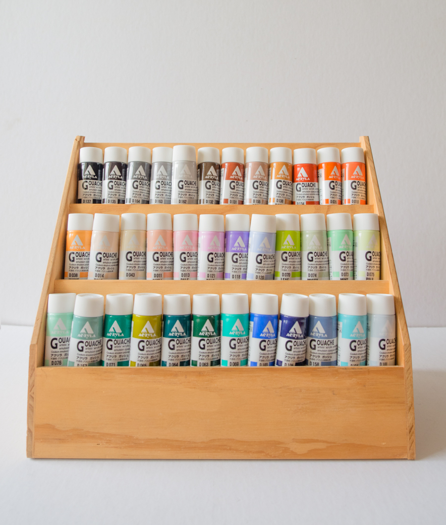
 The one down side to the Holbein Acryla Gouache is that the colours are not named in a traditional fine art sense, so you don’t know which pigments make up the colour; the trade off is that you get an amazing array of colours that are difficult to mix yourself. My favourites are the beautiful ash and pale colours, as they are muted in colour but are not muddy. The Acryla Gouache range comes in a total of 102 colours, including ten metallic and 4 luminous finishes, I only bought 36 colours to add to the Winsor and Newton colours I already own. I have a very strong feeling that I will be purchasing more though as I have absolutely fallen in love with these paints! unfortunately they are not available in Australia, they are made in Japan and I had to buy them online. I chose the colours rather blindly as I could not see real swatches, so I have included the paint swatches of the colours I got below. (Lighting and screen calibrations will obviously affect the look, so please use these as a rough guide.)


From L to R: Lamp Black, Sepia, Grey No.4, Neutral Grey No.3, Neutral Grey No.2, Raw Umber.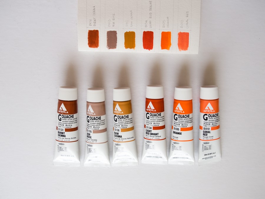
From L to R: Burnt Sienna, Ash Rose, Raw Sienna, Light Red Bright, Orange, Coral Red.
From L to R: Jaune Brilliant, Pale Peach, Beige, Shell Pink, Pale Pink, Pale Lilac.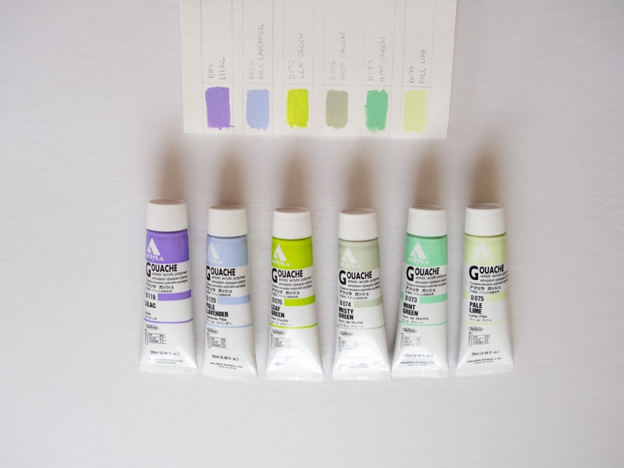
From L to R: Lilac, Pale Lavender, Leaf Green, Misty Green, Mint Green, Pale Lime.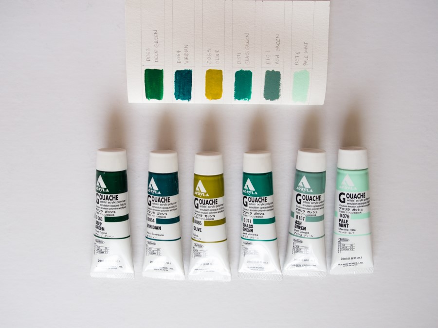
From L to R: Deep Green, Viridian, Olive, Grass Green, Ash Green, Pale Mint.
From L to R: Ice Green, Smalt Blue, Prussian Blue, Ash Blue, Pale Aqua, Misty Blue.
Schmincke Horadam And Polychromos

As a child there was always one thing I asked for during Christmas. It would always be ART SUPPLIES, and more art supplies! So Christmas came early this week in the form of a parcel from Dick Blick.
It has been many years since I have attempted to do any work with traditional mediums, as I am through and through a digital creative; I guess that sort of comes with the territory being a graphic designer where Adobe Photoshop, Illustrator and Indesign have become my standard tools of the trade. I never really liked using watercolours, I just preferred a more opaque intensity that I could achieve using acrylics or gouache. My dislike of the weak watery nature of watercolours was however proven wrong when I decided to pick up some professional artist grade paints. After some extensive research in to which brand produced highly pigmented watercolour pans, I chose German made Schmincke Horadam.

The paint pans come enclosed in a matte black enamel case with 3 separate areas for mixing your paints. As many reviewers have already stated, the lid doesn’t close tightly, if you are just using it on your desk this is not a problem, but if you need to carry it around I secure the lid with a Delfonics notebook strap, this holds it together snugly and even has a spot to hold a pencil or brush.

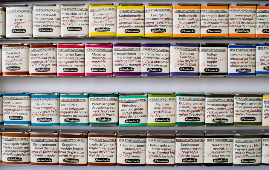


Each half pan comes individually wrapped, and they are all highly pigmented, no pre-soaking is required. The down side with Schmincke pan watercolours is that they do not sell the pans individually, but Schmincke are the only manufacturers in the world that use the same formula for their pans and tubes, so if you run out of a single colour you can buy the replacement tube and squeeze it into the pan and let it air dry. In addition, a colour chart printed on watercolour paper is included for you to make your own swatches. A handy tip is to get a waterproof marker and write down the name of the colour on the side of the plastic pan so you have a reference to see what colour you used, or should you need to buy a replacement tube.
 As if i didn’t spoil myself enough with a beautiful (read expensive) set of watercolours, I also indulged in the full set of 120 Faber Castell Polychromos coloured pencils.


I weighed up a long time on whether to get the Faber Castell Polychromos pencils or Prismacolors. I own a few of both so I did get to test them out first hand. Although i liked the saturated waxy colour Prismacolors offered, they are made of a soft lead, so they lose their point and aren’t as good for fine detail. Prismas also have a tendency to wax bloom, causing a dusty white cast over your work over a period of time. I decided on the Prismas because they are an oil based pencil so they are archival, acid free and won’t smudge. They also have a much harder lead so they have less breakage and maintain a point for fine details. Faber Castell have also been producing artist grade supplies since 1761, and with that much history creating pencils, you can’t go wrong.
Each Polychromos pencil is embossed with gold; labelling the colour, an a star rating indicating it’s light-fastness. The 3.8mm thick lead is bonded on to premium cedar wood, which I found sharpened smoothly with no splintering.
I am looking forward to using these supplies to create some products for the Quarter Paper Co launch line!
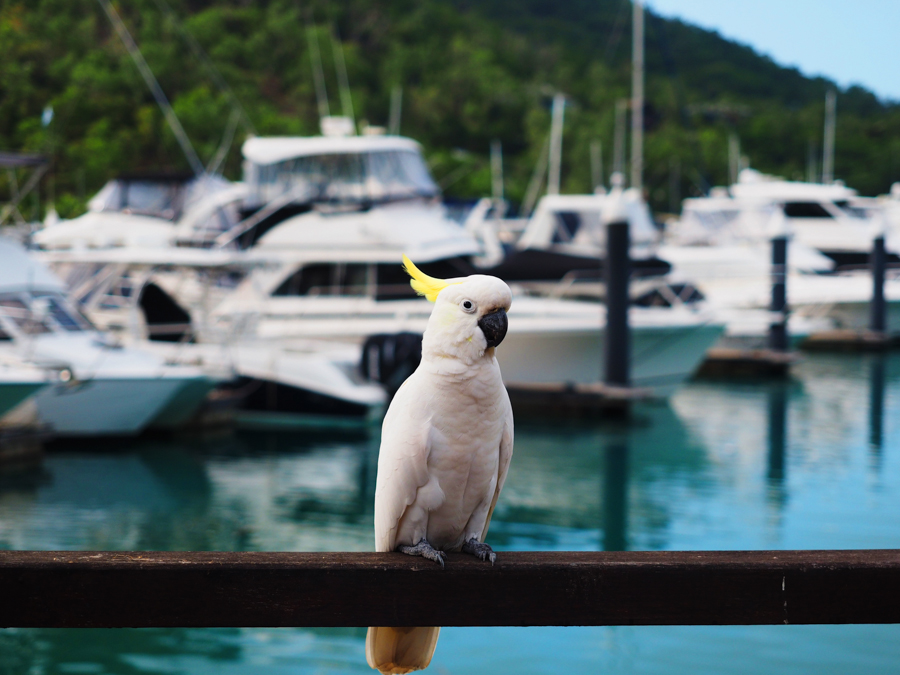
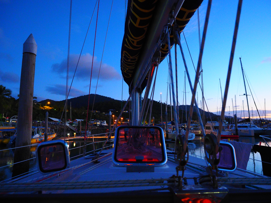
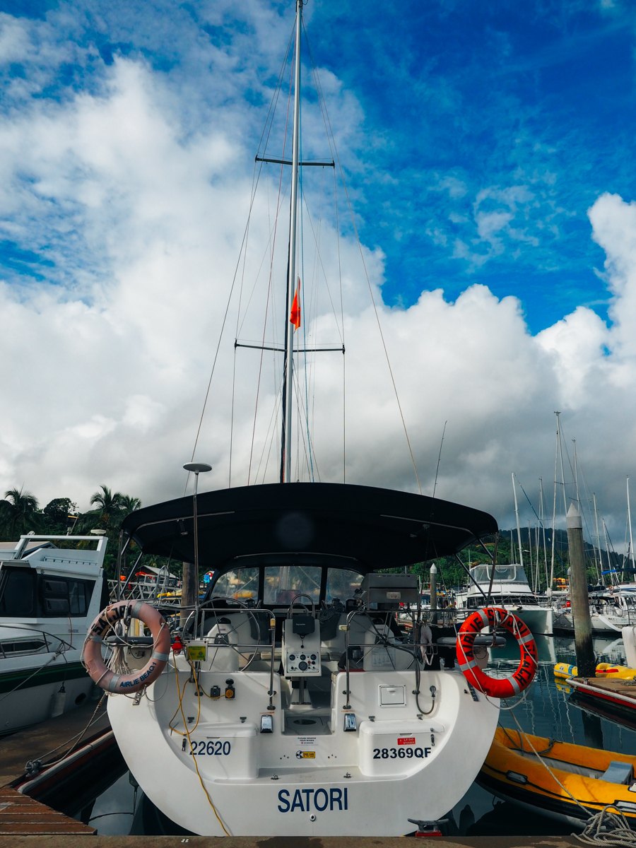
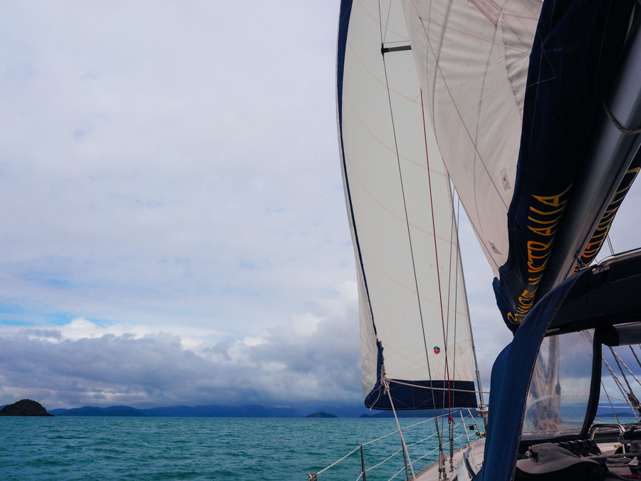
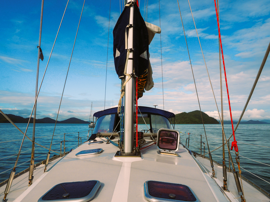
Sailing Whitsundays Photo Diary
When you think about the Whitsundays, you usually conjure up thoughts of warm glowing sun, crystal blue skies and water warmer than a hug from your nanna.
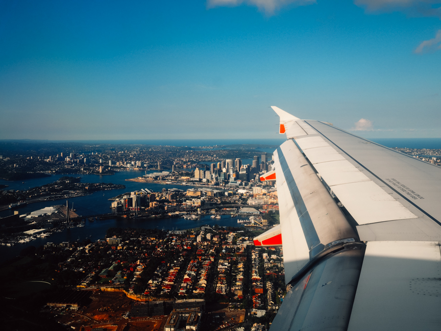
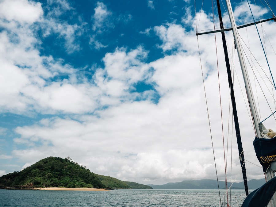
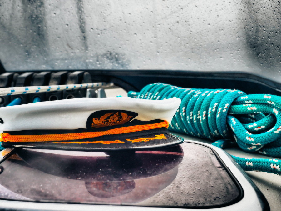
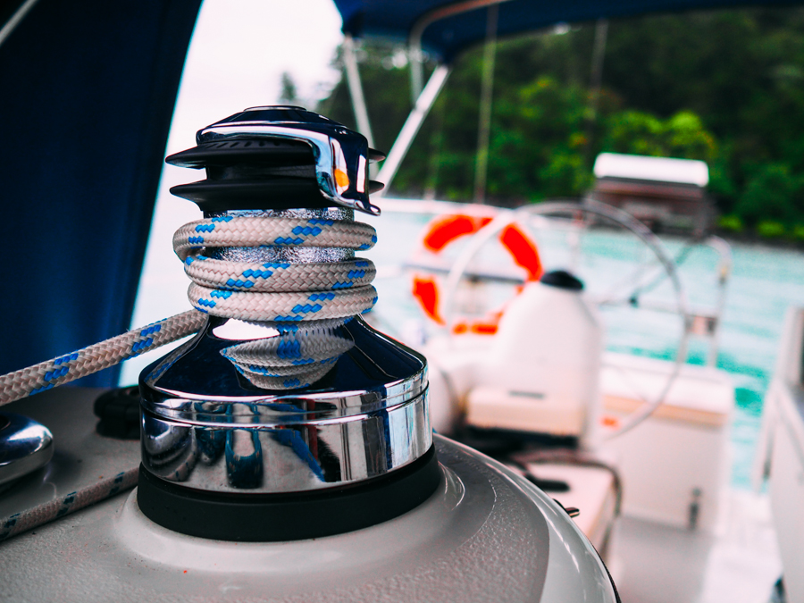
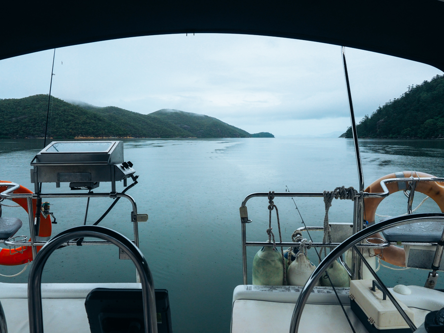
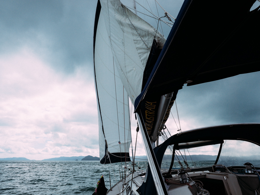
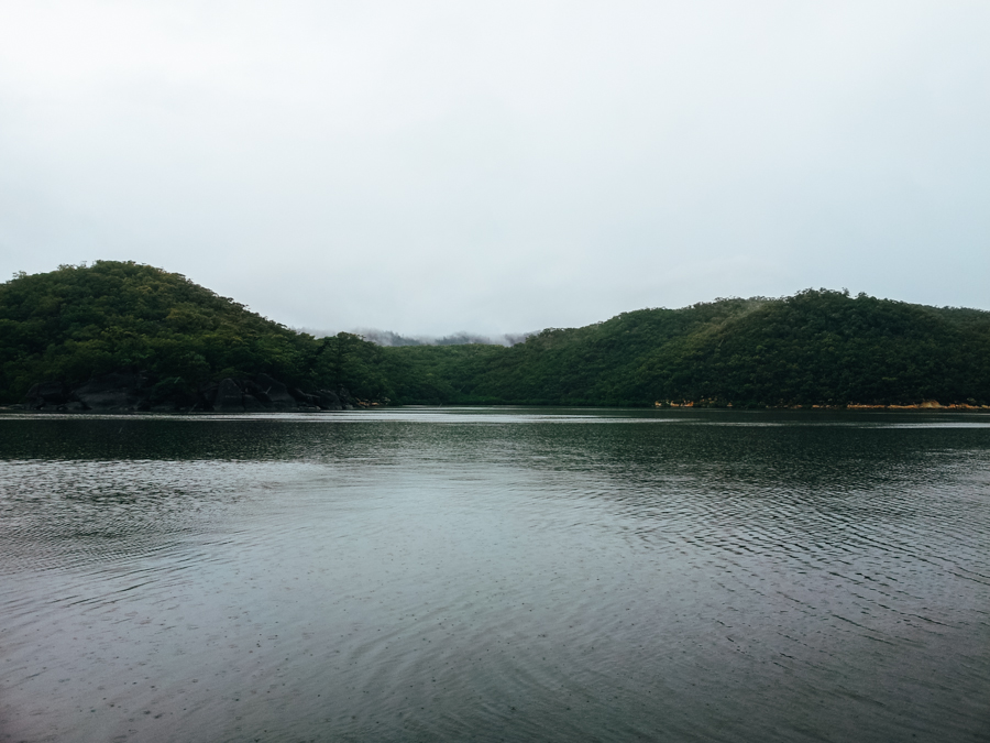
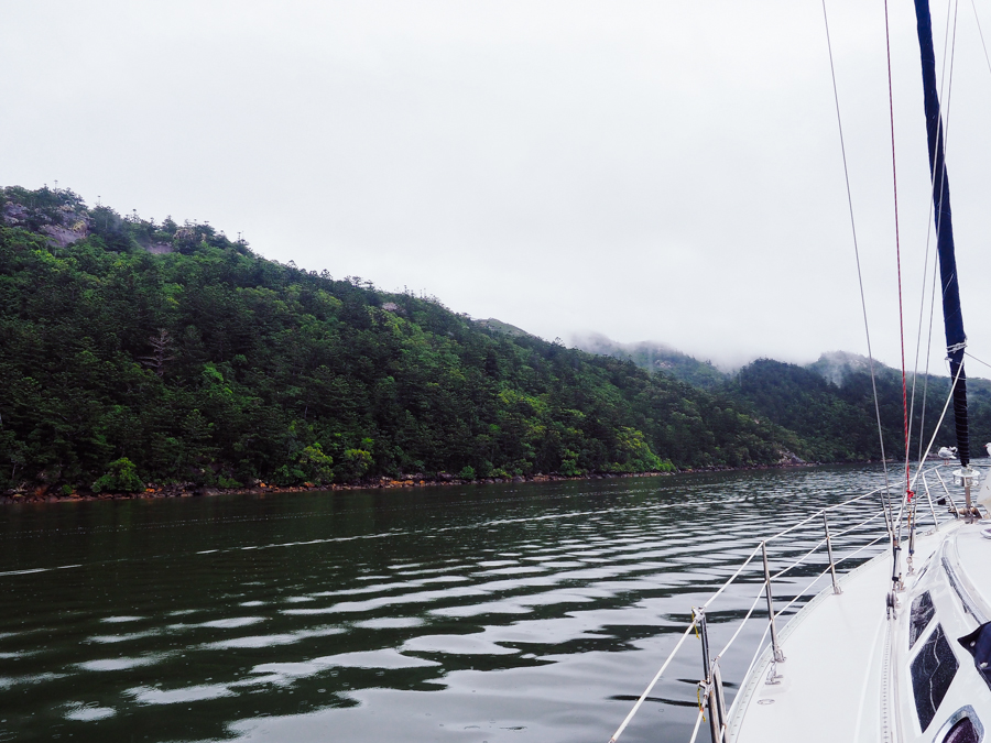
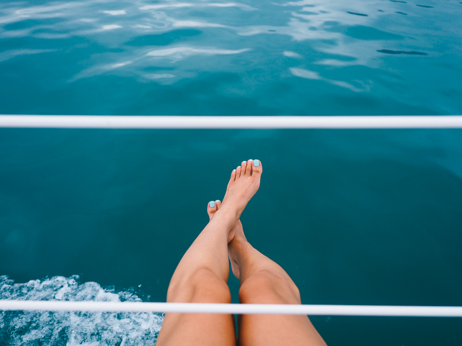
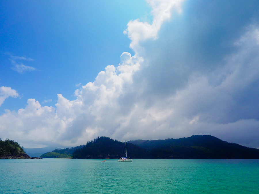
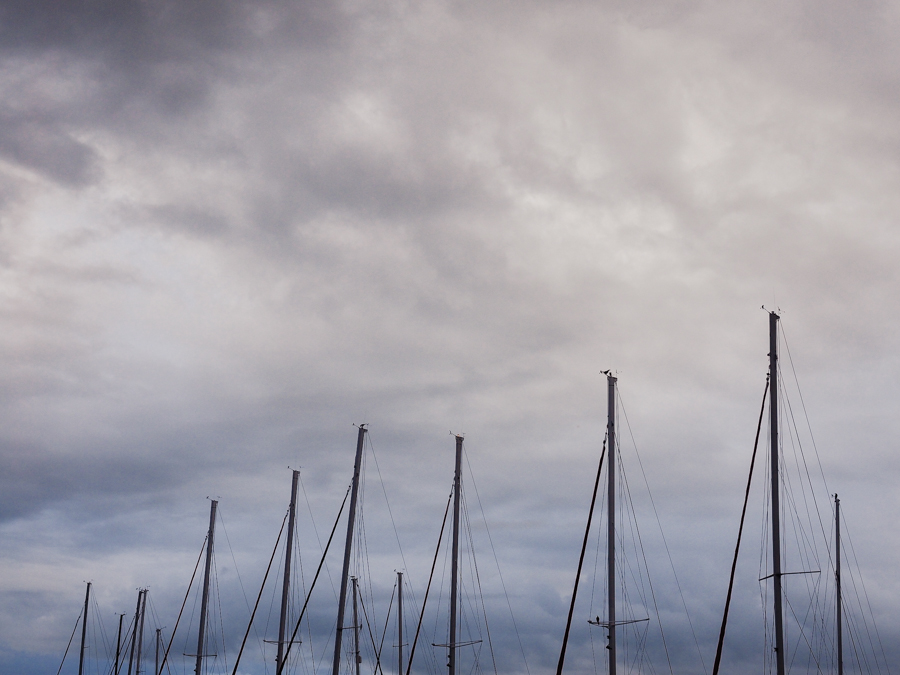
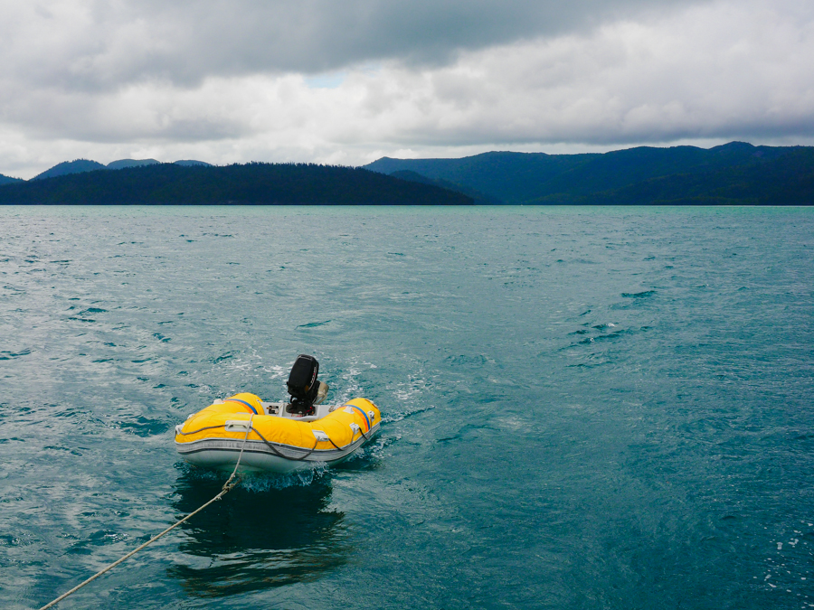
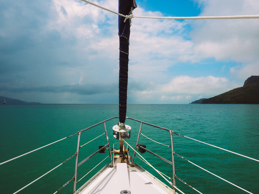
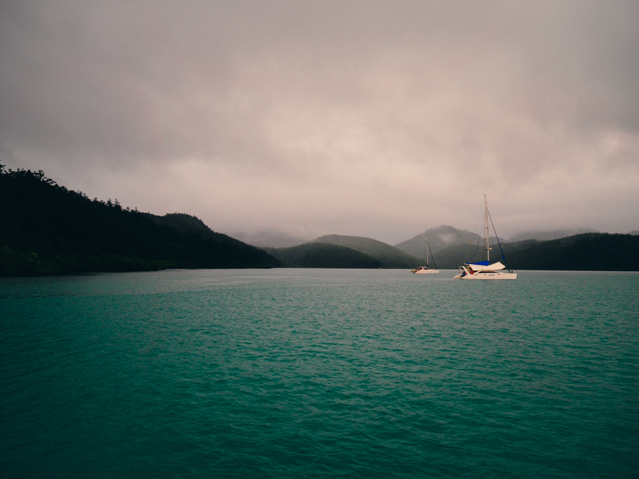
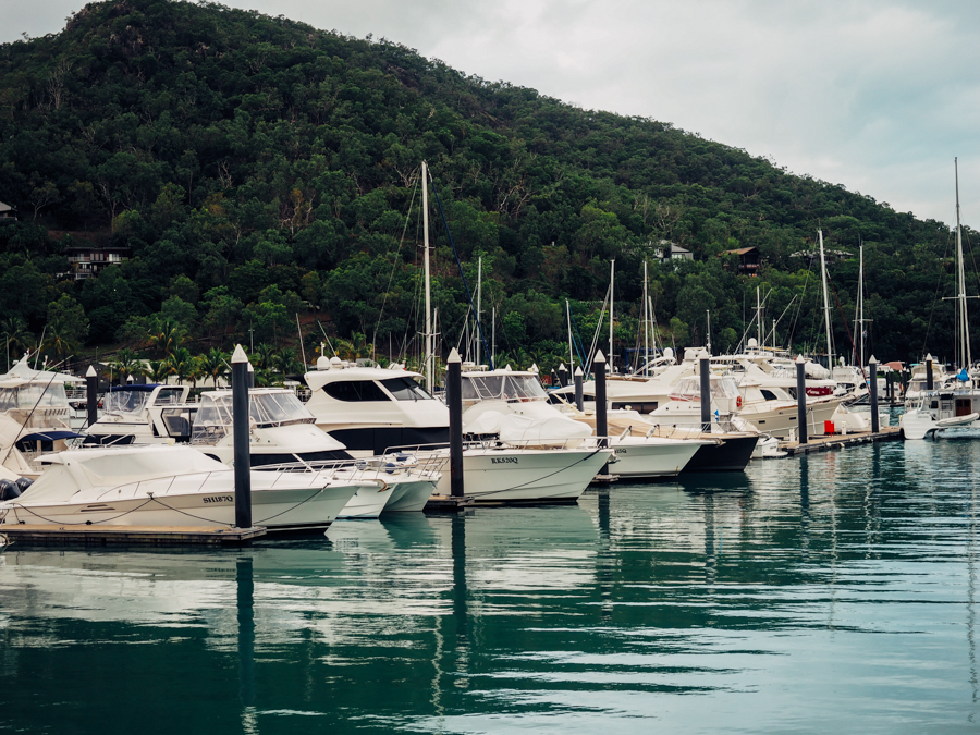
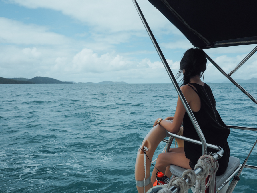
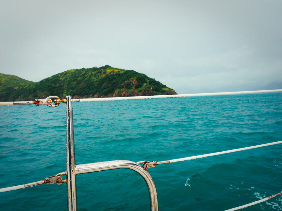
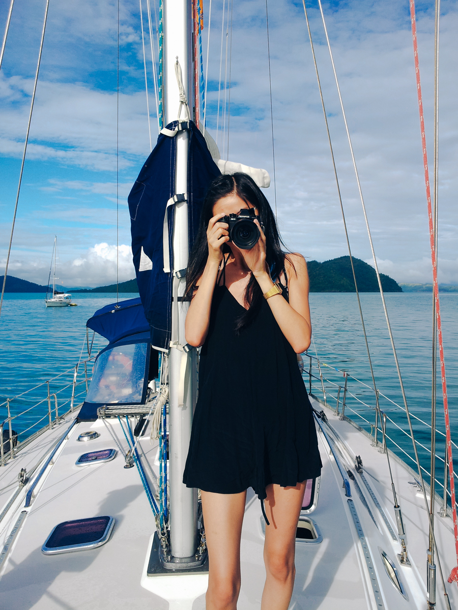
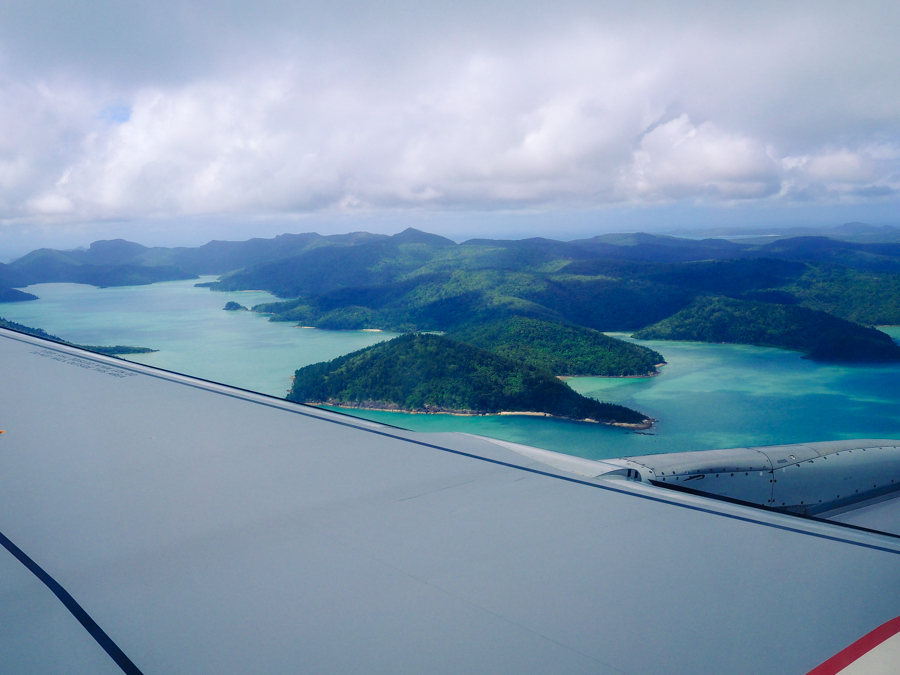
Well i think it is also necessary to add a whole bucket of torrential rain and perpetually being a sticky mess thanks to a not-so-lovely coating of sweat, sunscreen and humidity. That was the reality when I went sailing through the Whitsunday islands at the end of cyclone season, this may sound like a rant of a miserable getaway, but i assure you it was glorious. I don’t do resorts or get mani-pedi combos by the hotel pool– that is just not how I want to experience things, so even though I was drenched with rain for the first couple of days I set foot on our yacht and my fingers were turning into prunes, it was truly refreshing to just disconnect from my phone and enjoy nature. (My willpower is not that strong to just unplug from technology for a week — being in the middle of the ocean with no reception definitely helps, and far more relaxing than any digital-detox retreat.)
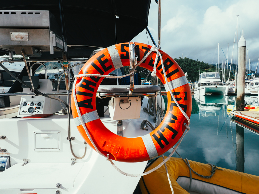
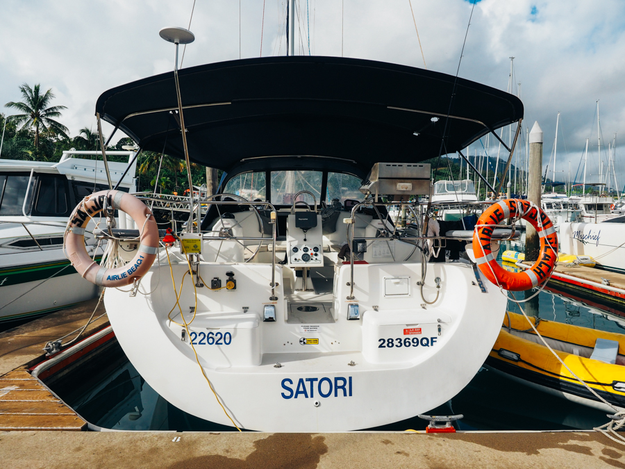
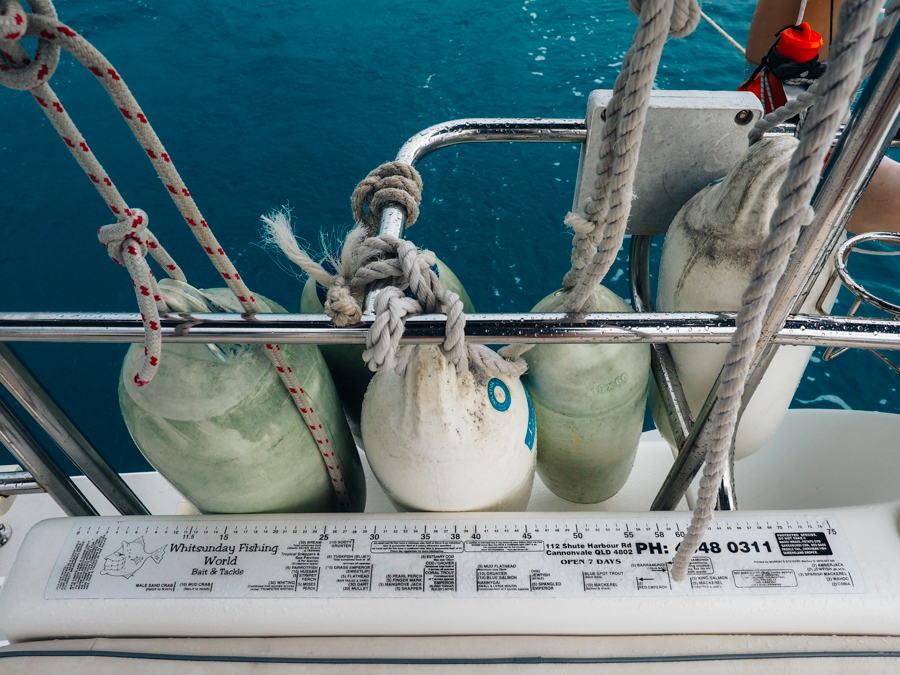
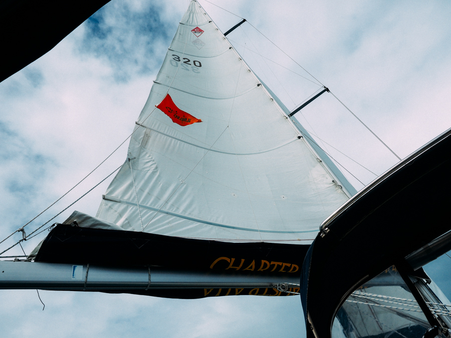
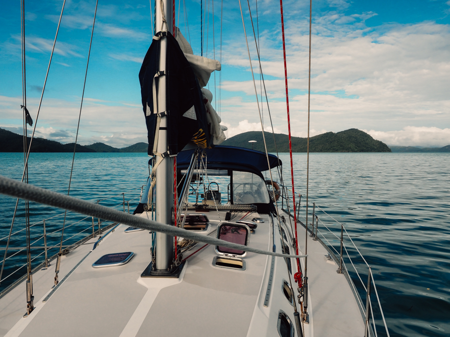
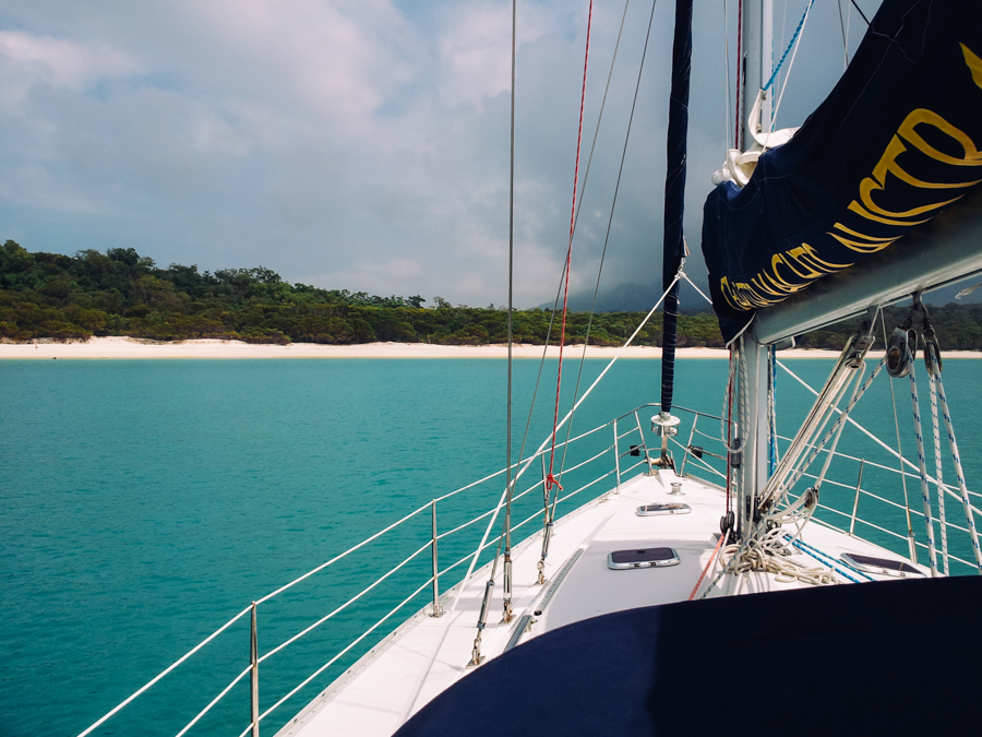
Before anyone thinks I’m the next Jessica Watson-sailing superstar; I think I should admit that I have never sailed before, I didn’t even know that there are nautical terms for the left side (port) and right side (starboard) of boats. So needless to say I wasn’t too confident to be sent on my way after one 4 hour briefing, I just made sure to pay extra attention on how to call MAY-DAY in the event our 40-foot yacht starts taking in water. One of us had some sailing experience, but overall we all learnt a lot on how to navigate the seas and it felt like an accomplishment after every day we set sail and made it to our destination safely.
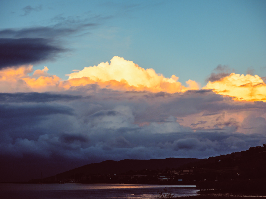
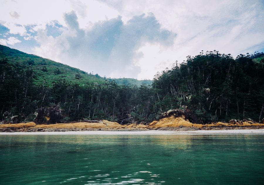
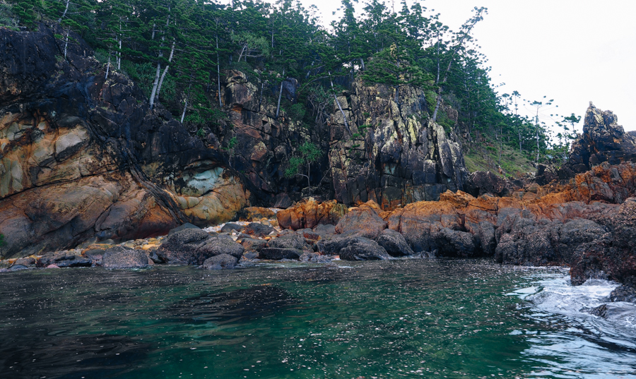
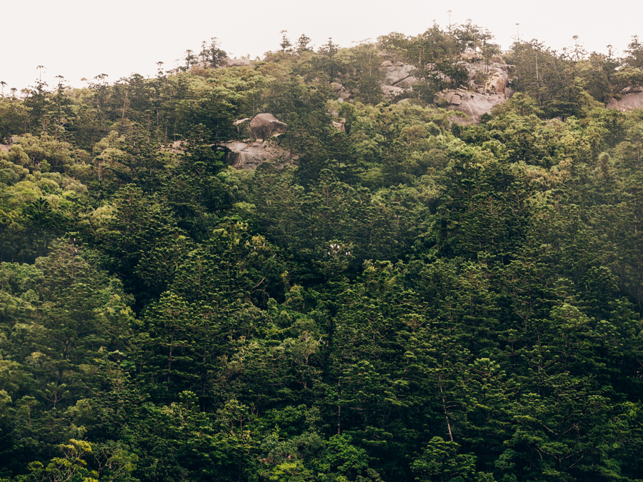
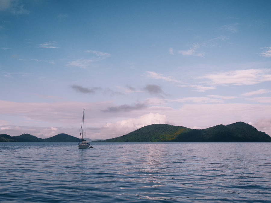
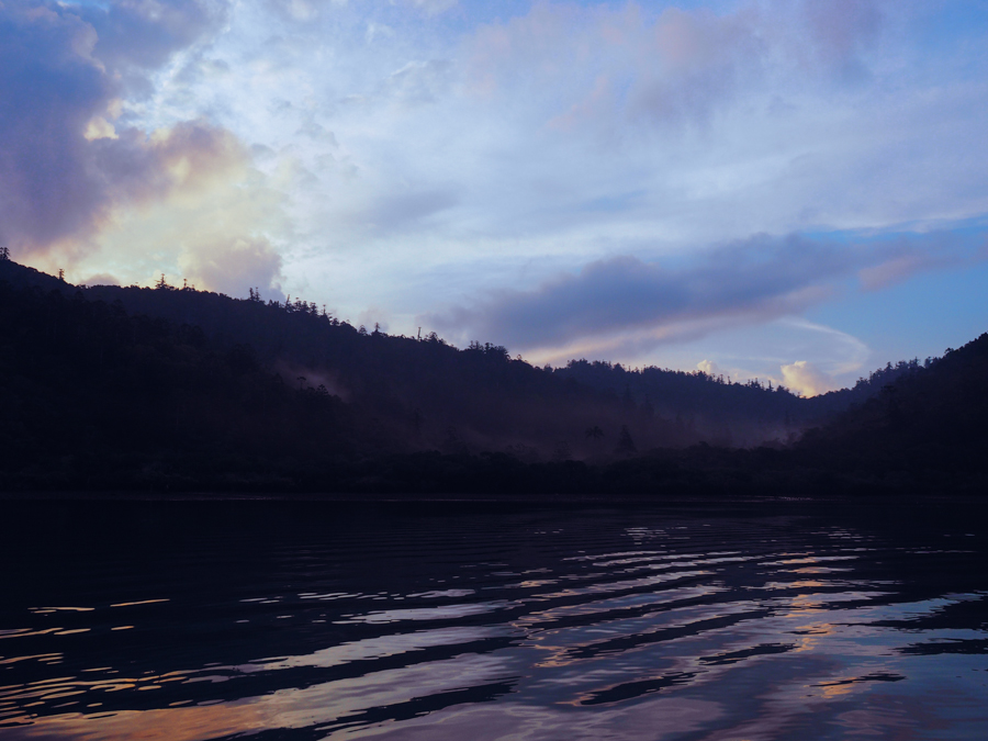
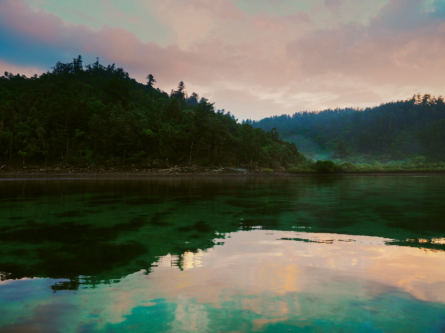
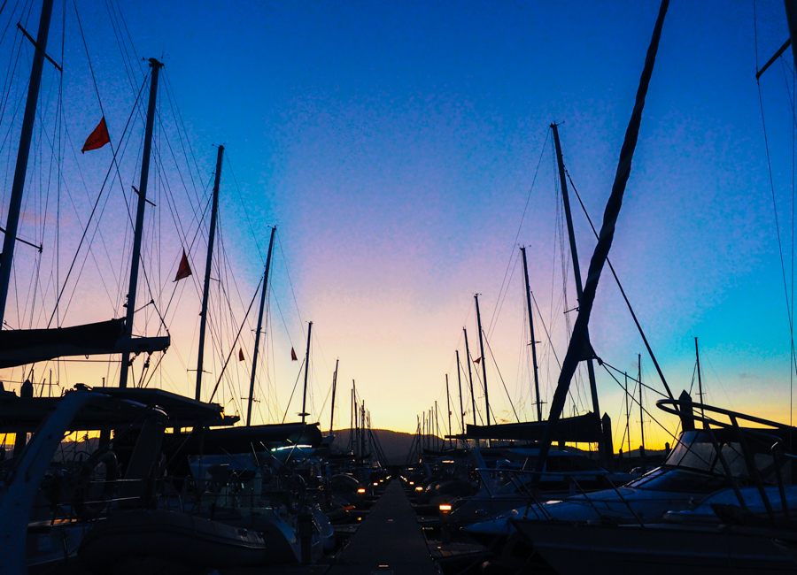
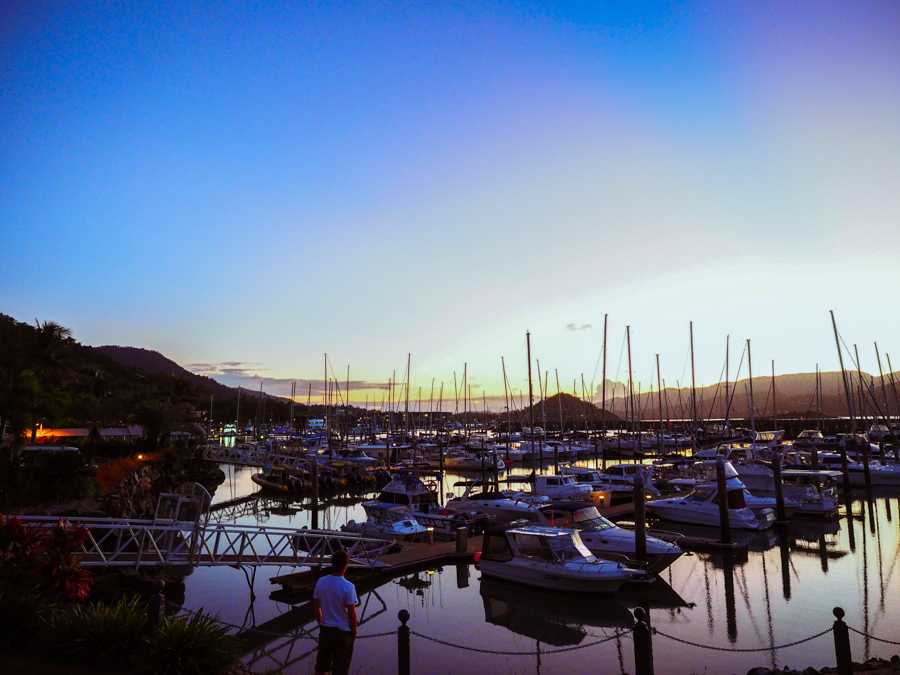
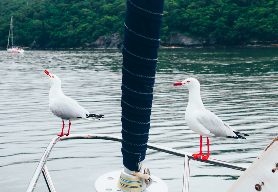
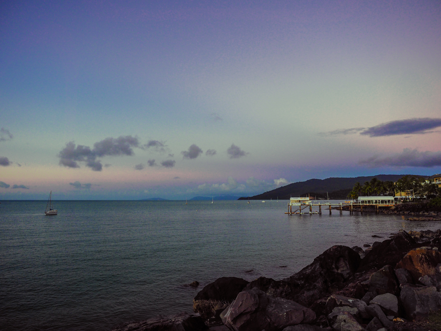
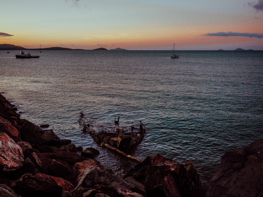
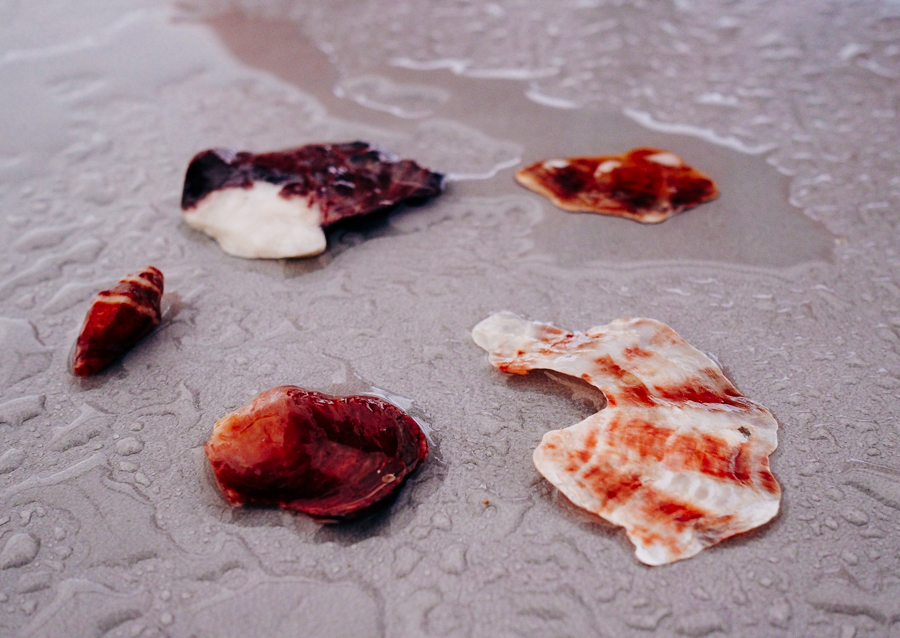
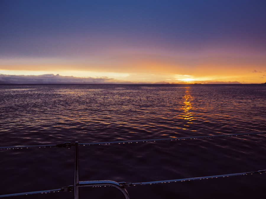
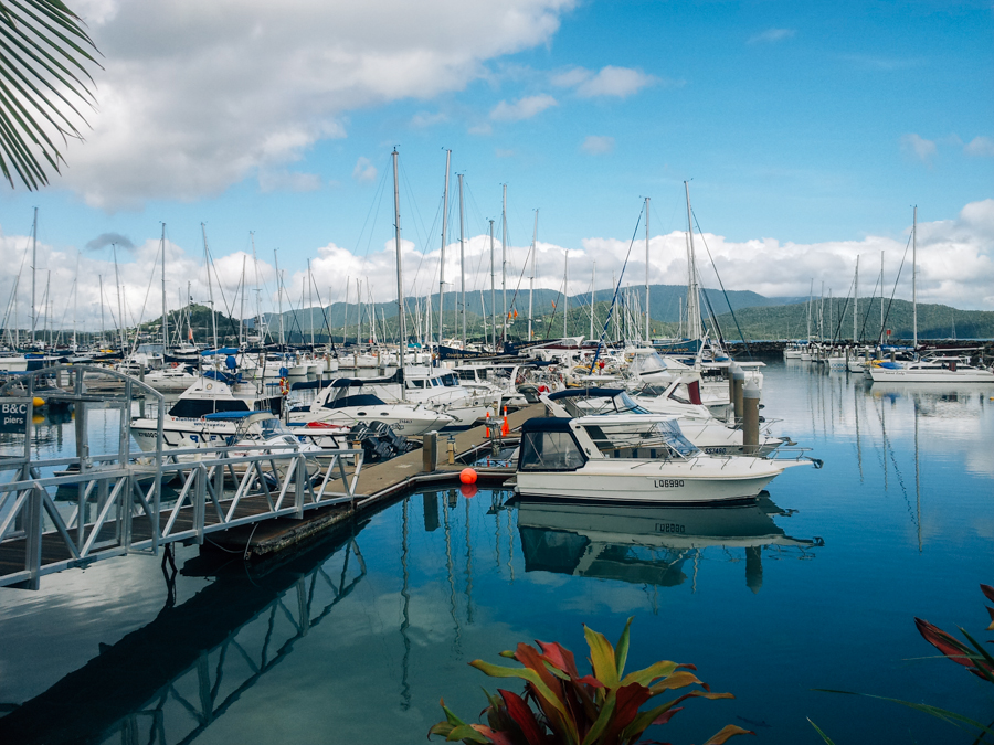
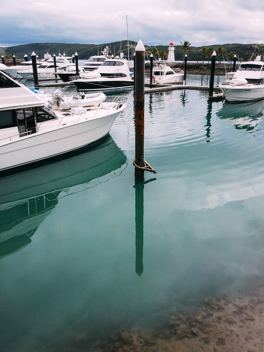
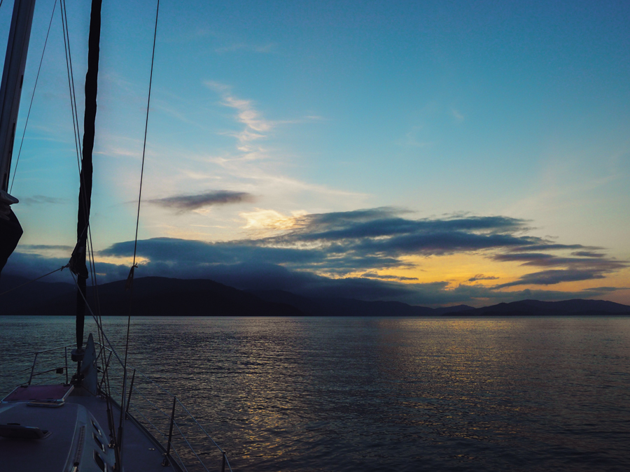
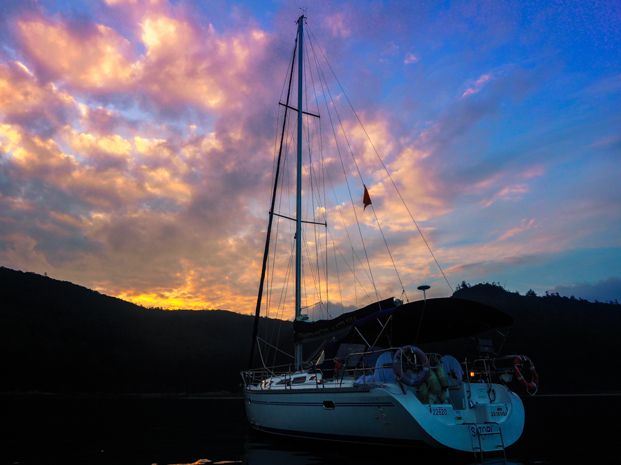
So I didn’t do the usual things like snorkel the Great Barrier Reef or hang out in a resort on Hamilton Island, but I did explore rockpools and waterfalls on untouched islands and witnessed the most stunning rose-tinted sunsets, and made a couple of turtle friends a long the way. When you’re stuck on a boat with no reception you don’t really get a sense of #FOMO, all you can do is lower your anchor, pour yourself a cold drink, crack open the chips and just watch the sun silently slip past the horizon of the ocean, and then you gotta think “this is pretty good.”

